Feature - Implemented Req: Dark Theme (from InfoPowerBroker)

As Gausie already said, I can make icons. But I'll need to know what style/what icons need making.
Glad to have you here, this is basically a modernization project, and it definitely needs lots of people/skills. The powers-that-be can discuss if they want to really revamp the icons or if they just want to clean up what's there now.

looking at kolmafia/src/images, it contains all the gifs on toolbars (and a few other things). There's probably nothing in there that can't get a refresh, but I dont think we should resize them without looking into how they're used (and how they were used 15 years ago...).

They look like 32x32 icons with transparency, scaled down from KoL's icons.

For instance, the council.gif is based on KoL's council_icon.gif without the text. That's a 100x100 icon in the browser, with a 60x60 (ish) image when you trim the text and whitespace. 15 years have at least produced better downsampling tools, and it's easier to edit transparent gifs as well.

Swing doesn't resize them for you, so the technical spec for icons is "max 32x32, gifs with transparency, that look good across a wide spectrum of white-to-gray-to-black"

I'm willing to re-think what icons are used for what. The ghost doesn't immediately scream "chat" to me, since I've been (officially if not always functionally) literate since 2004, but if we change the icons, there will definitely be people who weren't expecting us to ever change the icons...

These are the ones I see that need at least a look, and could use a replacement.
They are all square and no more than 32x32

Main Toolbar:
council.gif, browser.gif, command.gif, chat.gif, clan.gif, hp.gif, inventory.gif, equipment.gif, mall.gif, coin.gif, buff.gif, uparrow.gif, candypile.gif, arena.gif, preferences.gif, trashield.gif

Contacts Toolbar:
copy.gif, buff.gif, mail.gif

Chat Toolbar
who2.gif, highlight1.gif, highlight2.gif

Mini-Browser:
back.gif, forward.gif, home.gif, reload.gif

Sidebar:
refresh.gif

There may be others that get swapped in, but these are the ones I see...

The top two toolbars are current, flat dark is the new one...
three toolbars.png
This is all the toolbar icons I see that have issues we can fix...
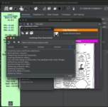
Flatmap Dark Icons.png
 
Indeed that might be an interesting project - does KoLmafia still need all of the embedded jars?

This is probably a different project, but I did a quick scan with IJ to see what was going on with the lib directory jars. Most of them are used by SVN, which is hard to say if they're needed for what we do with SVN. The only real oddity was edu.stanford.ejalbert, which is a directory for the classpath of BrowserLauncher2, but which was replaced with BareBones launcher in 2012.

In terms of the images folder, there are some images that I can't find any reference to in src/ or in data/. I think the navigation stuff (clear, delete, error, save all, stop are probably from some library.

I don't know about encyclopedia, museum, and who1 (who2 is in use, maybe it used to be there?)

iamges:
clear.gif
delete.gif
encyclopedia.gif
icon_error_sml.gif
icon_success_sml.gif
museum.gif
saveall.gif
stop.gif
who1.gif

Images also includes two additional files that seem to be in the wrong place:
jquery-1.9.1.js ???
barrel_smash.mp3 ??? -- This seems misplaced

I'd don't know where they should be, and maybe "images" is the best place, but they're not images...
 
src/relay/barrel_sounds.js has

var BARREL_SMASH_SOUND = "/images/barrel_smash.mp3";

That is built-in to KoLmafia.

relay/spacegate_sounds.js has

play_element("/images/spacegate_activate.mp3")

That is from the "Spacegate Sounds" scripts I published.

Both of the above activate only if the relayAddSounds property is true.

They are in images so that KoLmafia's built-in image cache will handle them.

jquery.1.9.1.js is used in the StaionaryButtonDecorator, but I don't know why it is not in /relay.
 
Last edited:
Note that images/scripts contains all the .js and .css that KoL itself has served to us from its image server.
/images does not mean the items are actually images. It just means that our image cache knows about them.
 
Note that images/scripts contains all the .js and .css that KoL itself has served to us from its image server.
/images does not mean the items are actually images. It just means that our image cache knows about them.

Got it. I can be very literal sometimes. :)
 
I'm willing to re-think what icons are used for what. The ghost doesn't immediately scream "chat" to me, since I've been (officially if not always functionally) literate since 2004, but if we change the icons, there will definitely be people who weren't expecting us to ever change the icons...

There are a LOT more existing KoL images available now than there were when these icons were selected. I frequently go through the images folders to find appropriate images to use in my relay scripts without needing to import new images, so I'd be happy to recommend some images to use as icons. (Though when I discovered I could hide the entire icon row, I happily did so. I'd still enjoy tracking down better icons from the KoL milieu if such there be.)

If we're revamping, it might be worth considering smaller icons as well. 32x32 seems quite large by modern standards.

My main goal is to not cringe when looking at pages in dark mode becaus images that are perfectly adequate with the built-in Looks are not masked well for dark backgrounds.

Better/newer/prettier/shinier/smaller/etc. buttons would be gravy. I'd love to know what you think we should do for the buttons. The list is a few posts back from here...

Smaller icons probably mean less detail to get the point across, things like "back" are easy to get across, game-specific ones seem more difficult. Still, probably doable.

Ambitious thing to add to the backlog: switchable icon sets in the Prefrences.
 
So, this is sitting in my backlog, waiting on a few things.
  1. testing reports from the prelim (working) patch
  2. new icons that look good on dark themes as well as light themes.
  3. This one error I found with "use system default Laf..." (edit: resolved)

Not to get all Scrum-Mastery, but Aenimus are you working on #2? Do you need/want help or to pass it back to someone else?

In the meantime, I looked further at FlatMap, and it now has 61 new themes instead of 3.

To be fair, some are useful (like high contrast themes for people who need vision assist), and some are garish ("just like Dark, but with Orange highlights!"), but while I am here to judge people for their Look and Feel choices, I am here to do it silently.
 
Last edited:
committed. r20534

The toolbar icons are usable, but could be improved.

Ditto the color schemes.

It shouldn't really be very different if you don't change the theme, but if you do, it should have 60 more themes.

I await reports of issues.
 
You folks are awesome.

Two some issues:

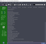
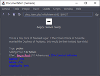
  1. The gCLI text becomes too small when using any of the new themes. (see pic 1)
  2. When in dark mode, the side panel text colors (blue when above/red when below base stat) are a bit demanding on the eye. (see pic 1)
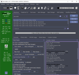
  3. In the "Location Details" panel, the default color for monster names and hit/evade/jump chances should be changed as well. (see pic 2)
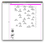
  4. Is the mini-browser supposed to be affected by dark mode? If so, I suggest it remain in "light mode" as usual. (see pic 3)
For the second issue, I propose an improved color scheme. Take it with a grain of salt because I'm no color scientist or UX designer.

P.S. Why no hot dog stand?
 

Attachments

  • r20534.png
    r20534.png
    61.1 KB · Views: 11
  • r20534-location-details.png
    r20534-location-details.png
    57.9 KB · Views: 11
  • r20534-mini-browser.png
    r20534-mini-browser.png
    12.3 KB · Views: 11
Last edited:
Well between me and my including jars and you and your themes the mafia jar is putting on some weight. It will be interesting to see if it matters. I am also amused by the timing since we are real close to a point release.

I am not someone who plays with themes and L&F in other software, applications or platforms. So I am quite intimidated by the choices in the L&F dropdown, including three(!) for Dracula which was the motivator of, if not the original scope for this work.

If there is a place where I could read something about each of the L&F that would make the drop down less intimidating.

From a debugging and maintenance standpoint, I can make a strong case for hiding all themes but one new one and making it clear that bugs will be fixed and tweaks made on that theme only until we feel most of the mafia changes have been worked out.

The left pane color and the refresh button are going to need some adjustment before I would use Dracula but that is a personal preference,

Thanks (said in a friendly, non-sarcastic tone. At some level I appreciate the work even if it is not benefiting me directly yet).
 
I will look at the bugs when I move from my iPad to my laptop, but here is the open source page from the devs. They have a demo app which is a good theme explorer.

themes are added in kolguiConstants and we can comment out any we think don’t work. Or set a pref for simple vs firehouse theme sets.

the app, like me and my cats in lock down, has put on a little weight. Nearly 20MB now.

It’s trivially easy to add a new theme now, so if someone wants hot dog stand, it can be added. I am not the arbiter of taste.
 
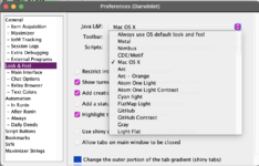
For anyone who finds this thread and doesn't know how to select a theme, it's in Preferences>Look & Feel>Java L & F> whatever appeals.

Screen Shot 2020-11-30 at 11.45.42 AM.png
 
Tweak: r20535 fixes the issue where some themes set the AdventureSelect.countField size too small.
 
Two some issues:

  1. The gCLI text becomes too small when using any of the new themes. (see pic 1)
  2. When in dark mode, the side panel text colors (blue when above/red when below base stat) are a bit demanding on the eye. (see pic 1)
  3. In the "Location Details" panel, the default color for monster names and hit/evade/jump chances should be changed as well. (see pic 2)
  4. Is the mini-browser supposed to be affected by dark mode? If so, I suggest it remain in "light mode" as usual. (see pic 3)
For the second issue, I propose an improved color scheme. Take it with a grain of salt because I'm no color scientist or UX designer.

P.S. Why no hot dog stand?

Thank you for reporting these!

  1. For me, the Flatlaf themes put 36 lines in the same space that the native themes have 33 lines. Your gCLI has about 40 lines. Might be this flatlaf/openJDK issue. I can try changing that setting, but it's not necessarily fixable. What OS version/Java version/Theme do you see this with?
  2. I like your scheme. Will try it.
  3. Department of "things I didn't try". I knew there would be ways of using KoLmafia that I would discover by doing this. Might take longer, if #2 doesn't fix it.
  4. It probably should be dark except the response pane. Good catch. I don't use the mini-browser (it's broken on a lot of things for me, even in the default theme (see below))
Screen Shot 2020-11-30 at 1.59.37 PM.png
 
I don't use the mini-browser (it's broken on a lot of things for me, even in the default theme (see below))
View attachment 10002

I'd like to hear from someone else but I think the Mini-Browser is working as designed. It does similar things for other pages as well. My recollection is that Hola did not want to require a relay browser nor deal with what, a decade ago, were issues based upon which version of which browser a user was running. But there were times when mafia needed the user to see a page and do something. So moving where clickable links appeared was deliberate as was limiting scrolling to one dimension.
 
I'd like to hear from someone else but I think the Mini-Browser is working as designed. It does similar things for other pages as well. My recollection is that Hola did not want to require a relay browser nor deal with what, a decade ago, were issues based upon which version of which browser a user was running. But there were times when mafia needed the user to see a page and do something. So moving where clickable links appeared was deliberate as was limiting scrolling to one dimension.
I'm not against it, I'll just never use it as is. That's fine, different strokes, et.al.
 
Back
Top